CourseMap case study
UI/UX concept
CourseMap was a semester-long project for my human-computer interaction course at UGA. I worked on a team of 5 to research and design a concept for a new education website that could replace current educational websites such as Canvas, BlackBoard, and Google Classroom.
Role: Researcher, designer | Date: 2024
Final prototype ↓Background
The assignment was to solve a problem related to EdTech. After some brainstorming, we realized one major problem with current educational technologies is a lack of customization to meet student's individual needs. The problem we are choosing to focus on is the current lack of customization possibilities within edTech. We believe that a lack of personalization inhibits students’ ability to engage with their coursework and also limits teachers from being able to cater to individual needs. Students have diverse learning styles and requirements, and a lack of customization may force students to learn in ways that are not conducive to their education.
We also believe that those with learning differences or visual or motor impairments are entitled to an educational experience that is fully customized to their needs. A lack of personalization can prevent students from maximizing educational potential from these softwares. Overall, giving the users – whether it be instructors or students – more control over their experience through the option to customize it will benefit them and their learning/teaching in a meaningful way.
Defining the Problem
Initial interviews
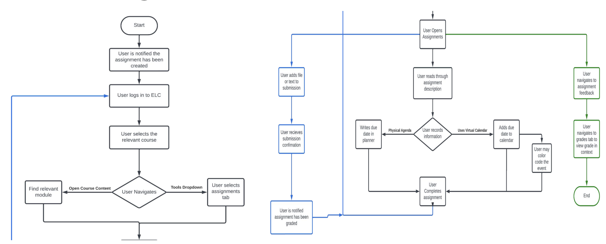
The first step we took was interviewing students at UGA to see their current frustrations with UGA's eLearning platform, ELC. ELC is used for communication for classes, viewing and uploading assignments, posting class discussions, and more. We interviewed a variety of students with different majors and years about how they use ELC, while gathering feedback on what they would change and improve.
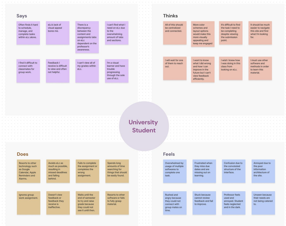
Throughout our interviews, we noticed that the most prominent complaints across all users interviewed were the following:
- 1. Lack of Consolidated View for Assignments and Schedules
- 2. Desire for Customizable Layouts, Notifications, and Preferences
- 3. Ineffective Feedback System
Existing system analysis
Based on the interview findings, students find that eLC succeeds in:
- 1. Site’s simplicity makes navigation easy
- 2. The UI is clean without many distracting options
- 3. The notifications from when professors post things
- 4. The app’s easy accessibility compared to the website
Based on the interview findings, students found that eLC lacks in:
- 1. Announcements not being cohesive across the platform
- 2. The inability to reply to emails from eLC while in eLC
- 3. Features such as help, Kaltura, etc. toolbar being unnecessary
- 4. Not having more appearance customizations such as dark mode, changing the cover images of classes, etc.
- 5. Not having a tool to view the course grade
- 6. Usage of eLC being different across different professors, and a lack of standardization
- 7. Communication method within classes, similar to what Microsoft Teams has
Understanding users
Personas
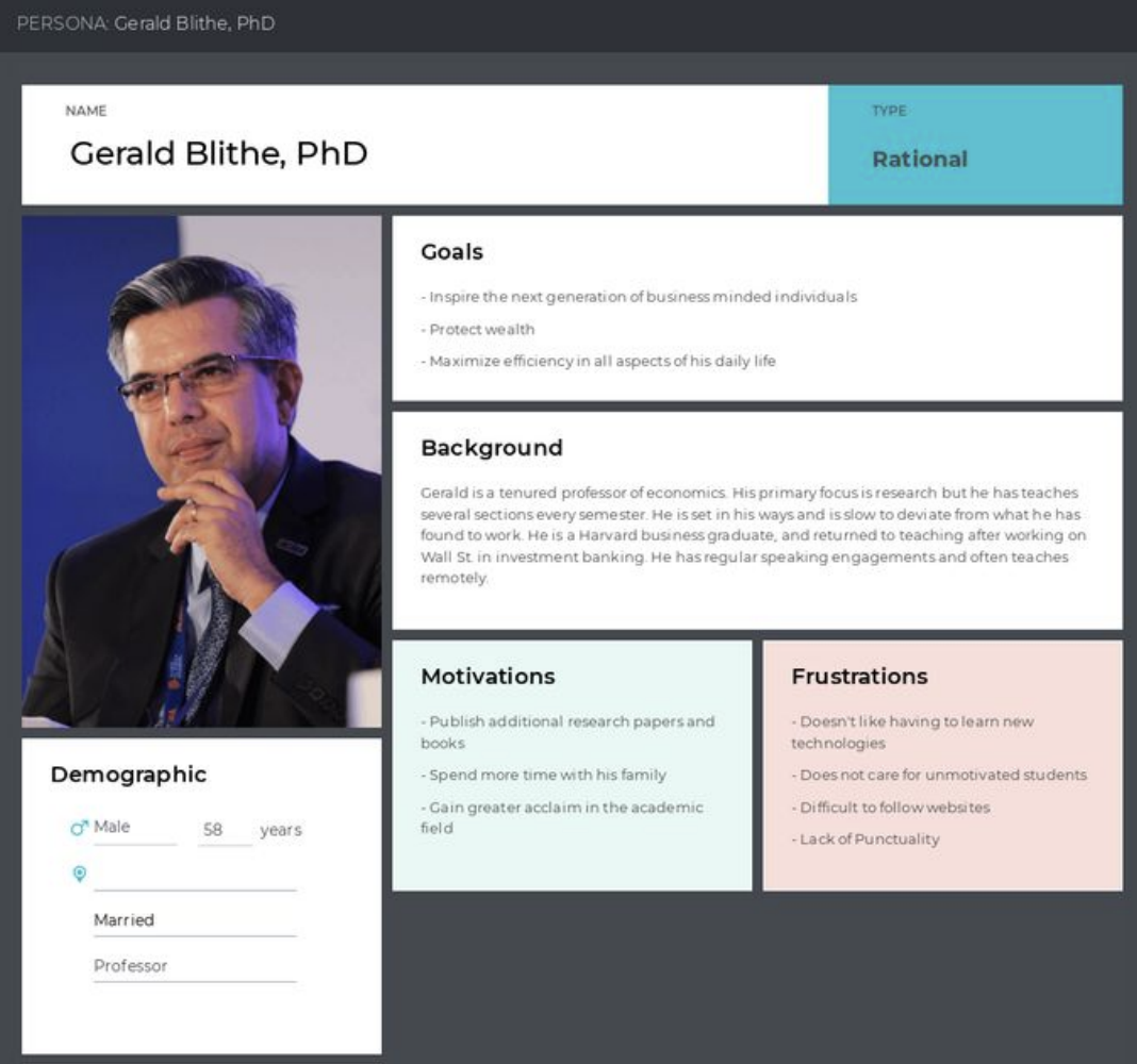
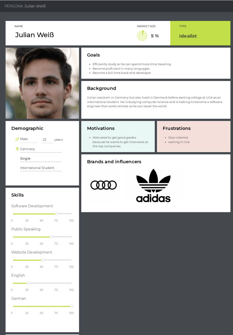
For our created personas, we wanted to focus on extreme users as well as lead users. Some of our personas include:

Additional interviews
We interviewed additional students to gather more information on what they would expect out of a new eLearning platform for colleges to adopt.
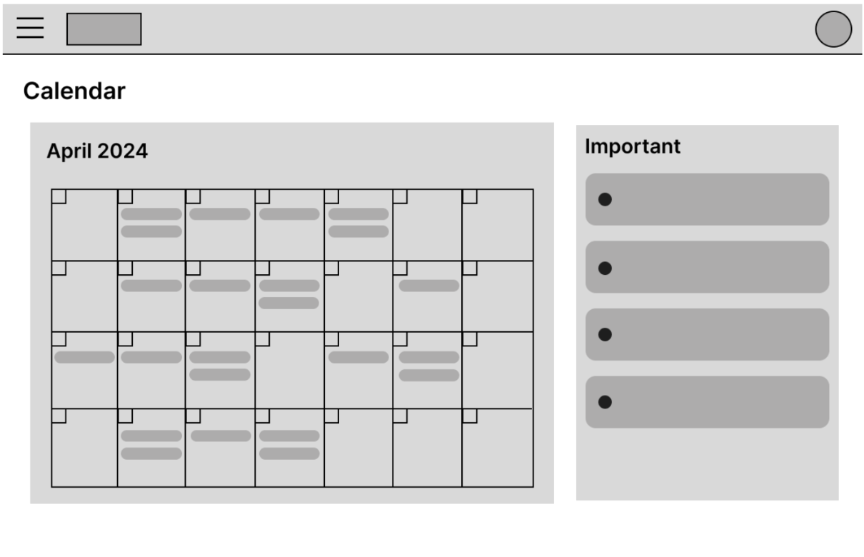
In every single interview, the interviewee mentioned wanting an improved calendar function. Based on this, we can conclude that this is the most important personalization feature that should be added to ELC. Alongside the calendar function, the interviewees also expressed that ELC has less standardization between classes, unlike Google Classroom and Canvas, so there could be some improvement on that. An example of a solution for this would be to create a new calendar that uses data from a students personal calendars and syncs it with educational platforms like ELC. Through these new interviews, we learned a lot more about how students view the platform and were able to know what features are most important to be changed.
Early Ideation
Brainstorming
We came up with three solutions to solve problems found with existing systems.
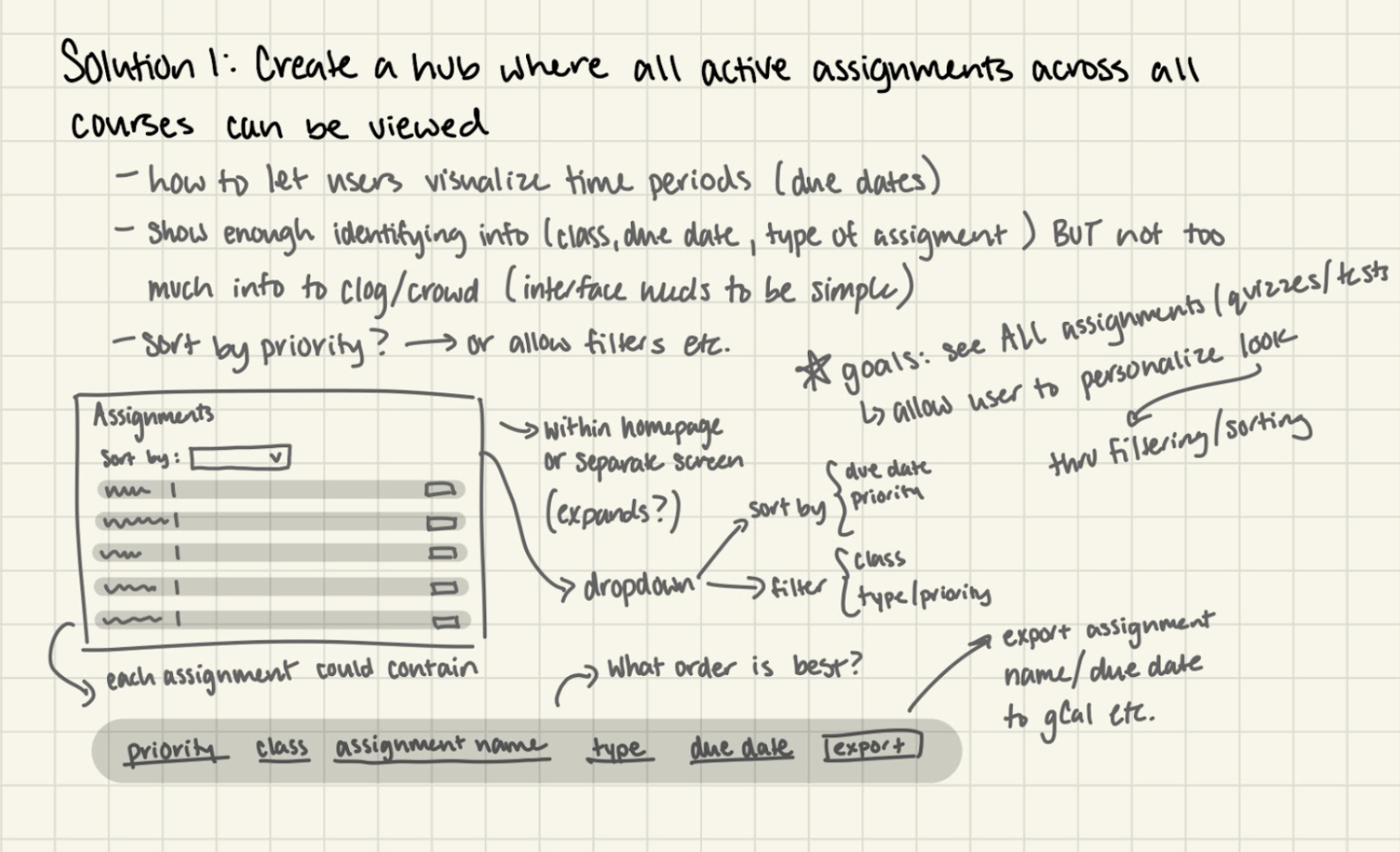
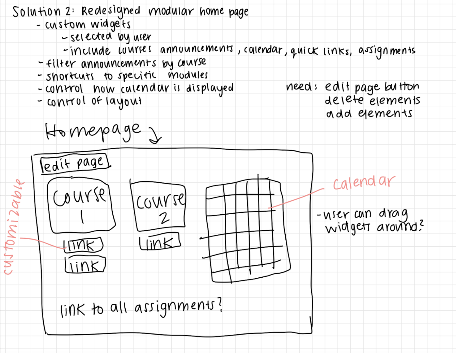

Our goal is to empower students to take command of their education, giving them a suite of powerful organizational tools that allows students to focus on what matters. Every learner is different and our product caters to students on the individual level, providing robust customization options to ensure our users' needs are met. Because of the structure of our application and the similarities it shares to a detective map, we landed on the name CourseMap. With the ability to move or pin widgets and modules and the flexible structure of the interface, users are now in the driver's seat, taking control of their own learning experience. Our slogan is “CourseMap: Create Your Own Path to Success”.
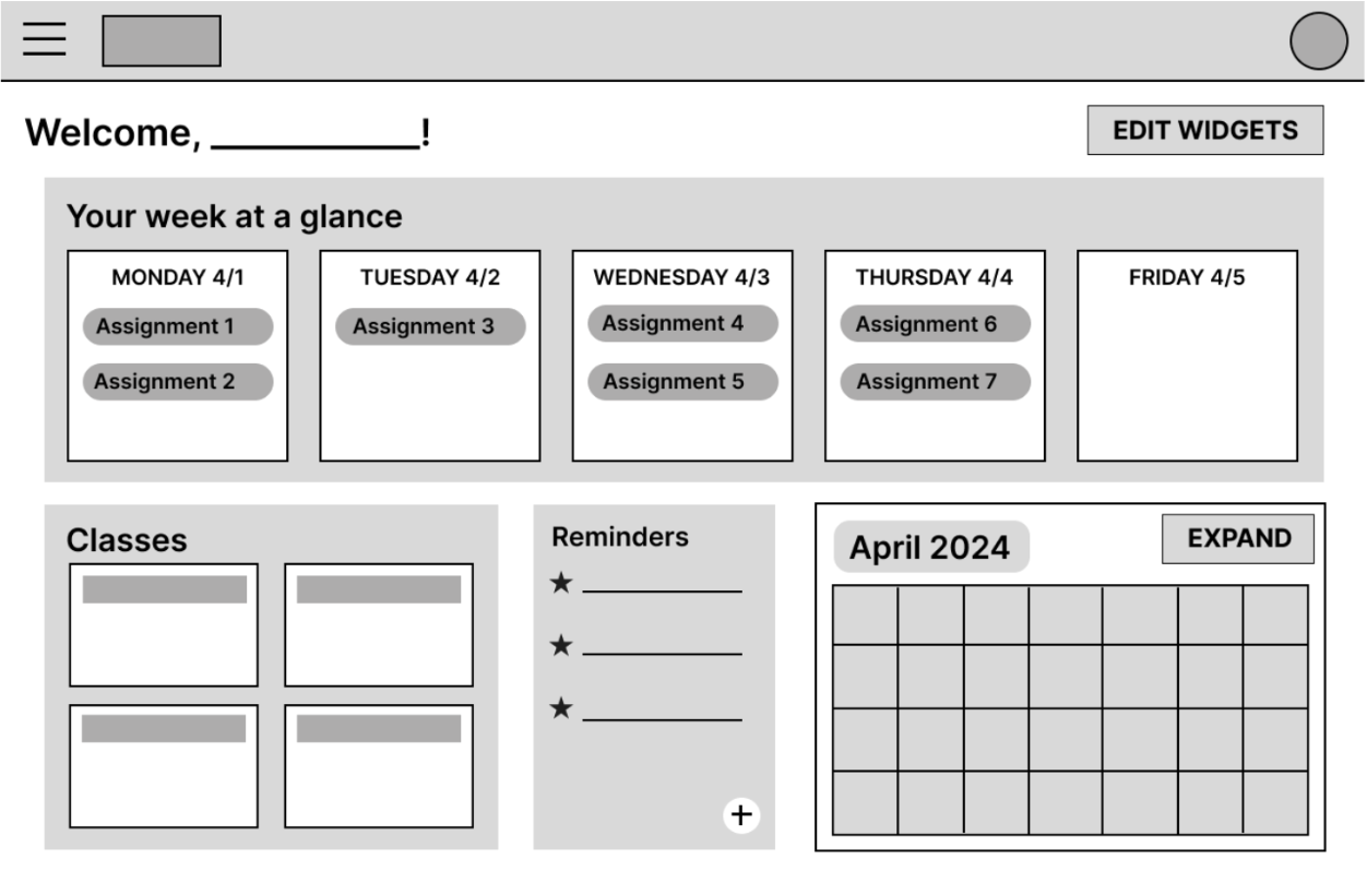
Our problem area is the lack of customization possibilities within the field of educational technology. The prevalence of cookie-cutter solutions does a disservice to learners and instructors, inhibiting students' ability to fully engage with their coursework and limiting teachers' ability to cater to individual needs. Our solution was to create a new web portal for accessing course materials. Our design philosophy when crafting this solution was to create a truly customizable “command center” putting everything students need to succeed right at their fingertips. To achieve this emphasis was placed on maintaining information transparency without creating excessive visual clutter. To achieve this we proposed a modular central hub, utilizing widgets to provide overviews of all necessary information directly on the home page. These widgets are fully customizable allowing the user to determine which elements are most important to them.
he solution we elected to implement combines elements from each of the three solutions we proposed in the previous milestone. As we outlined the strengths and weaknesses of each solution it became clear that the approaches dovetailed nicely and could mitigate each other's weaknesses. The concepts regarding the centralization of information and achieving information transparency were taken from the first and third solution proposals, while the emphasis on personalization present in the second solution was applied throughout. Our final solution is much stronger than its predecessors as it is able to provide tools to help students fully engage with their work while also providing features that could be molded to individual needs. Students and instructors at institutions of higher education would be interested in our solution. We hope through our focus on personalization opportunities no communities will be left out, however we acknowledge that the burden falls to the user to make full use of the customization options. In consideration of this, we have endeavored to make the customization page as intuitive as possible.
Sketching
Below are some initial sketch ideas:
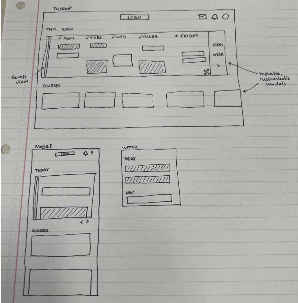
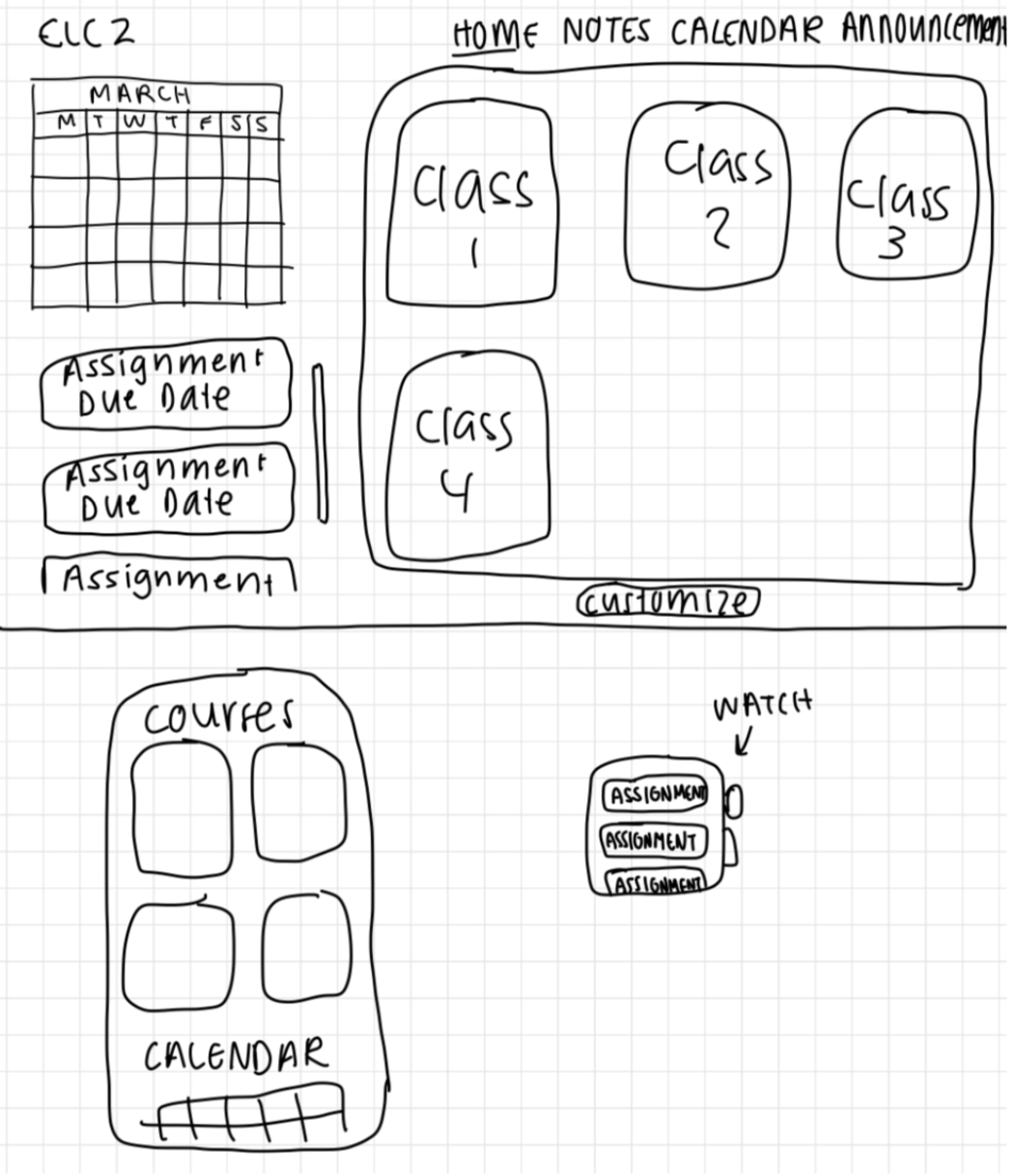
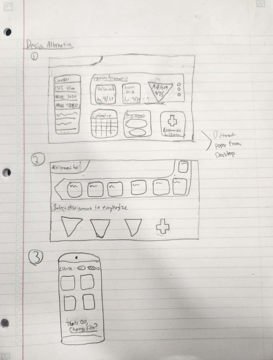
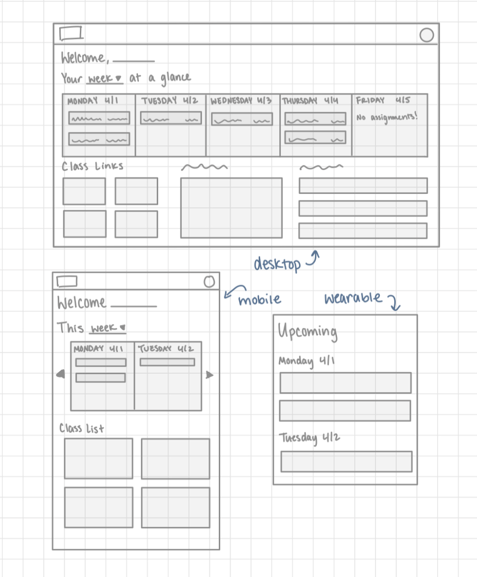
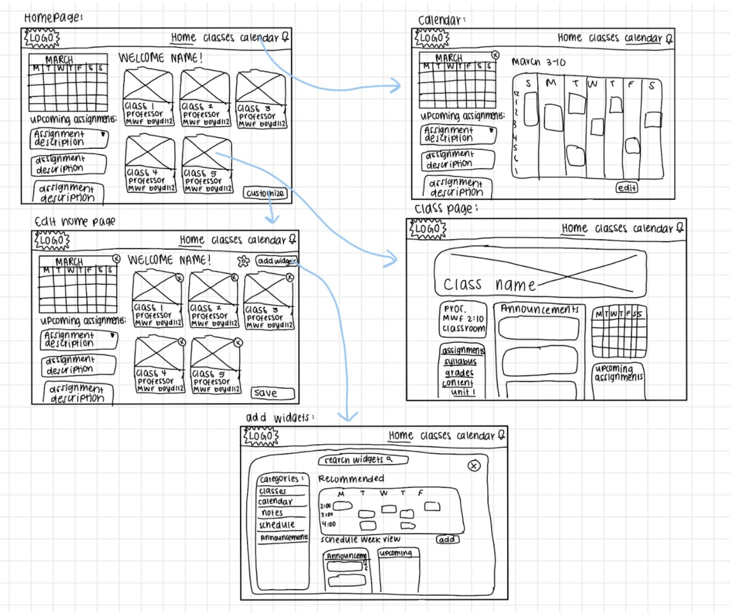
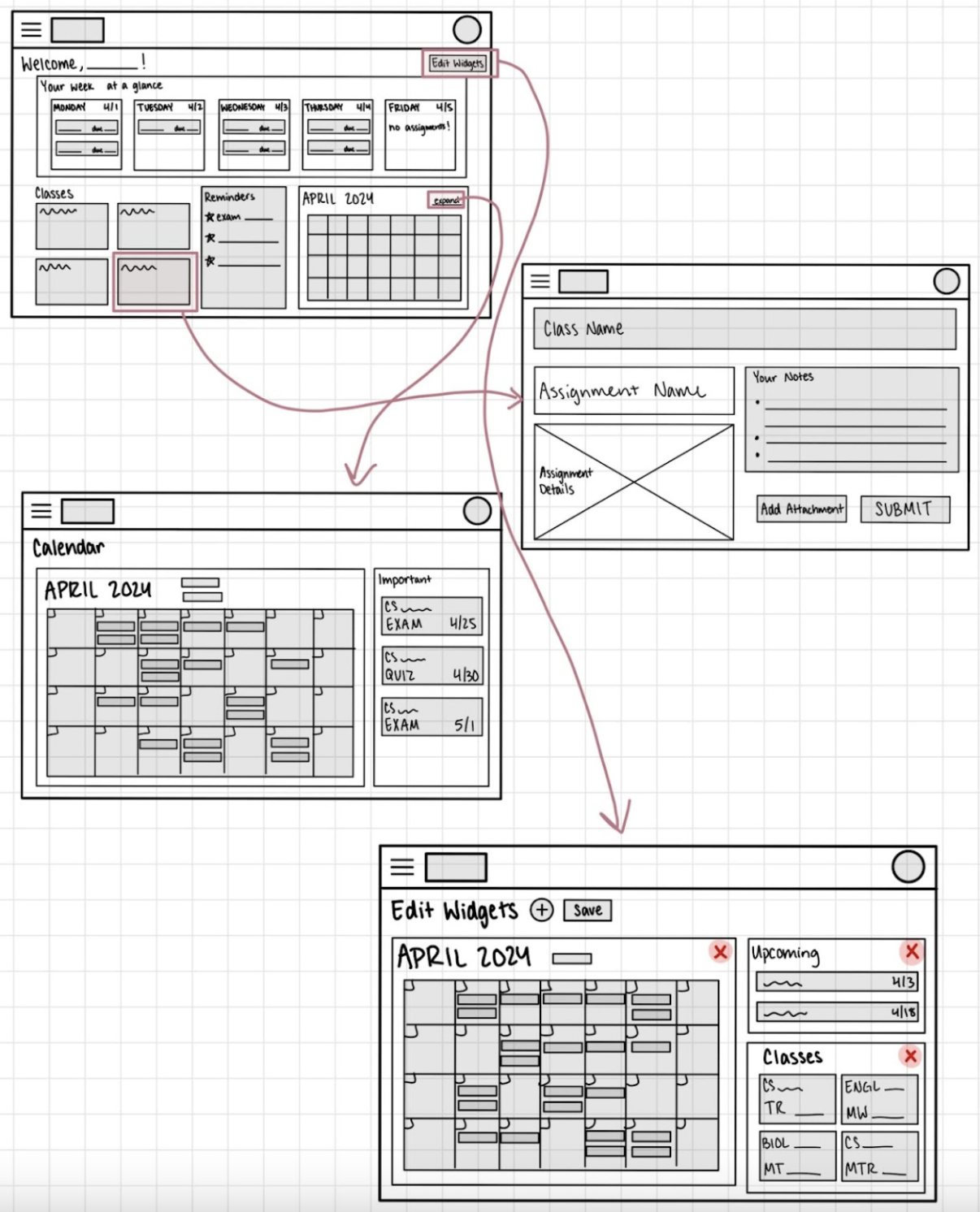
Low-Fi prototype
User testing
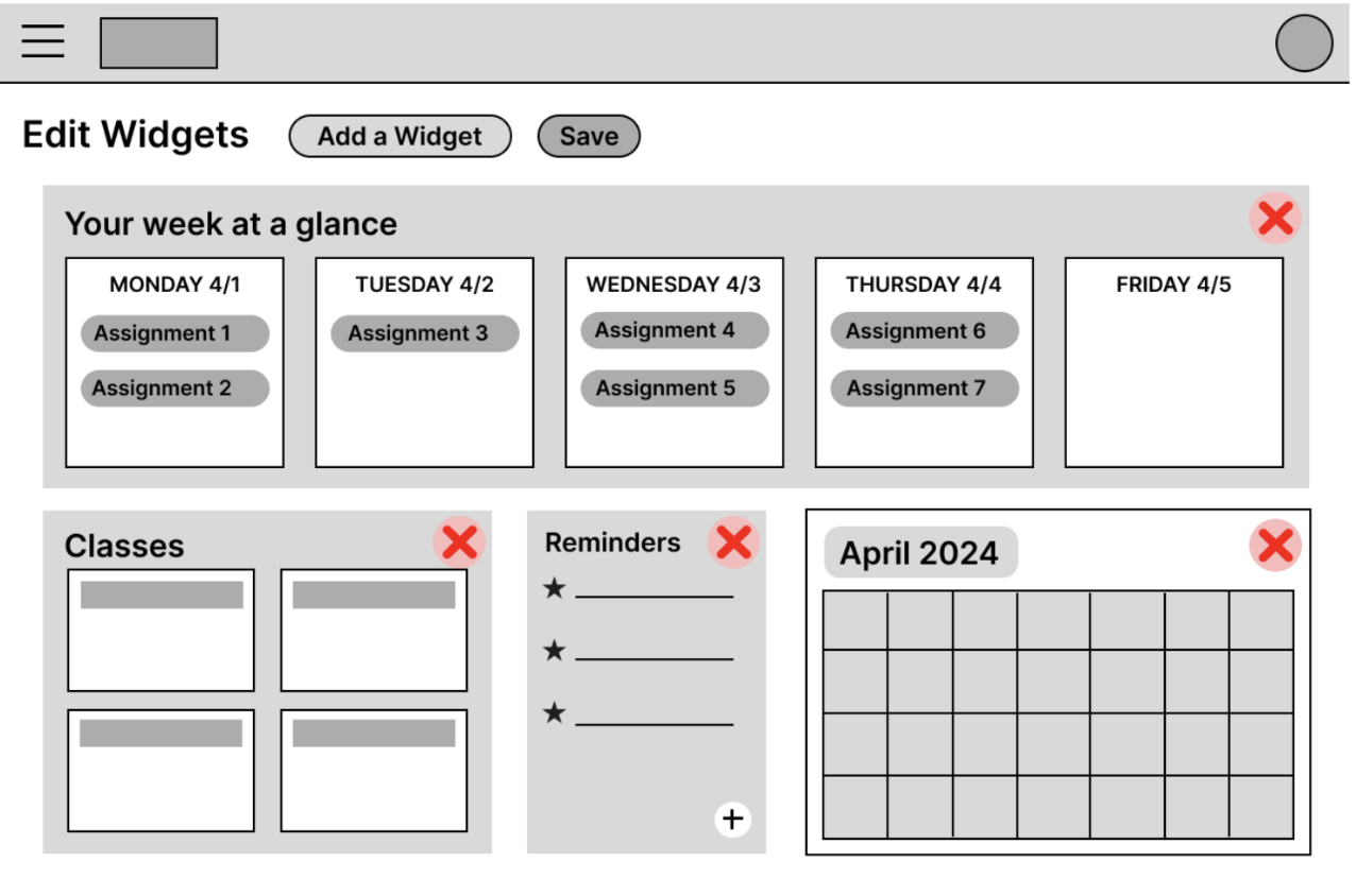
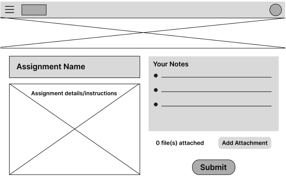
Here, we performed additional interviews to test the usability of our solution. All participants were tasked with adding a reminder to the system, viewing assignment details, and turning an assignment in, and customizing the homepage which involved adding, removing, and rearranging elements. The goal was for the participant to be able to intuitively use the new functions of eLC without aid from the facilitators. The user would easily be able to locate all the new functions of adding reminders, assignment details, and areas to customize the homepage. Testing procedures involve giving the participant a rundown of the session being an interface testing session. Then, the consent form would be given to confirm the interviewee’s participation in the interface testing session. The participant would then be asked to perform three tasks and would be asked follow-up questions upon their completion of each task.
After completing the interviews, we concluded that our design successfully improves user experience in three specific areas according to the interviewees.
The first is simplicity, the large component grid layout made it easy for all interview participants to quickly identify the tasks asked of them. By keeping our components independent and easily identifiable, interviewees all agreed the prototype was easy to learn. This low barrier of entry produces higher user satisfaction especially for those who are not as familiar with technology. Each component is divided into similar sizes so nothing is hard to find.
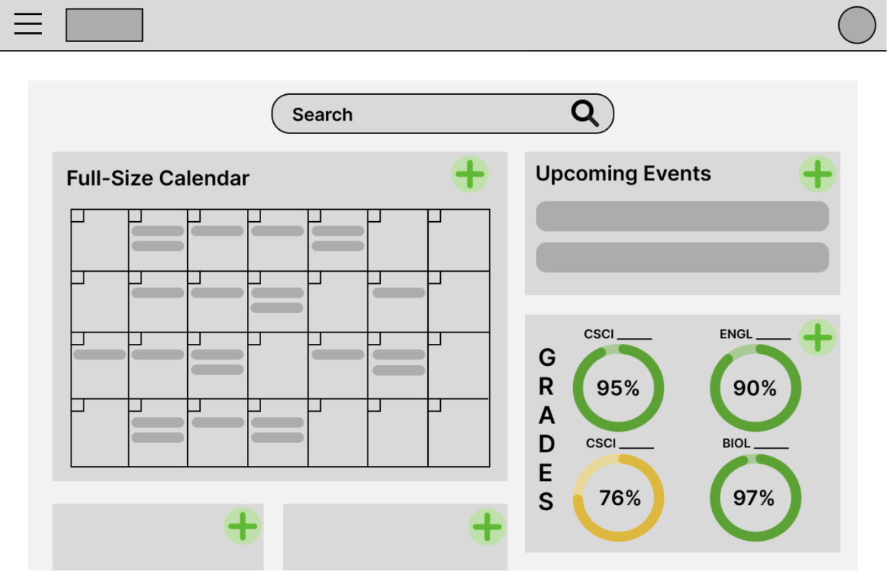
The second successful improvement is the use of large recognizable icons. Multiple interviewees commented on our use of icons while customizing the homepage. The use of red Xs and green plus signs allowed the participant to know exactly what was happening on screen. They said the icons being in the top right corner was also a nice touch because it felt natural to look there. The use of these icons allowed the homepage to distinguish when you are customizing, adding, or removing widgets without having to completely redesign the page.
The last improvement was the customization enhancements. Interview participants agreed that the simple customization options allowed them to enhance their homepage without overwhelming them with options. The drag and drop feature makes it easy to move components and because they are all similar size they can fit anywhere in the grid. The participants also liked the potential components we proposed. Grade percent visualizer, Reminders, Week at a glance, and Calendar were some of the most appealing to the participants.